
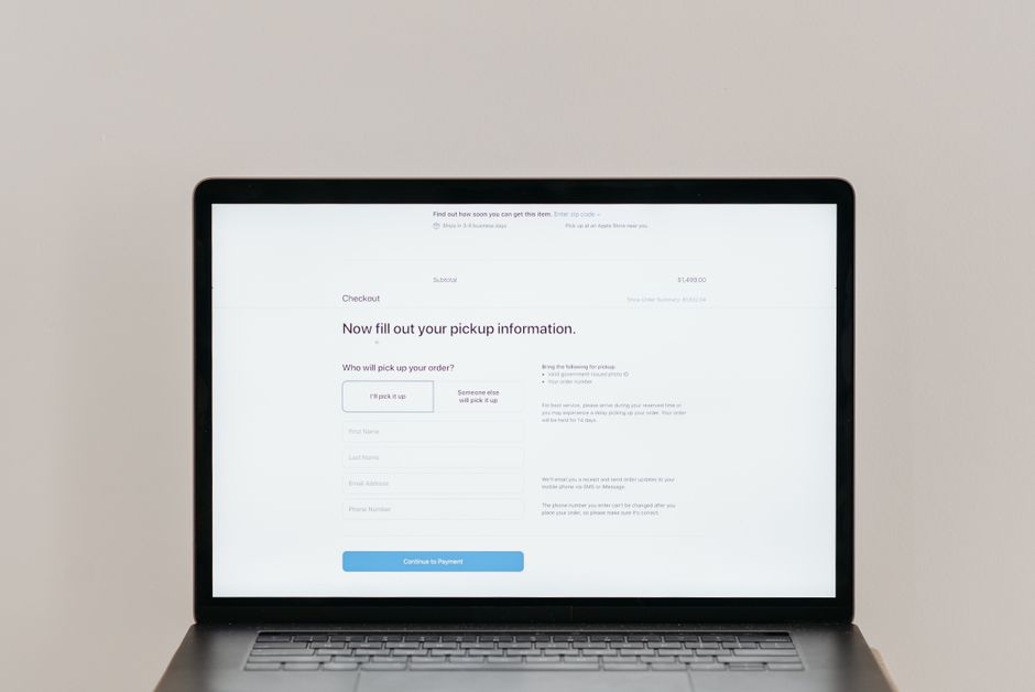
Many business owners spend weeks crafting their homepage and product pages. They focus on color palettes, typography, and imagery to capture attention. Yet the final step often receives the least amount of design attention. The checkout page is where a visitor decides to become a customer. This step carries unique pressure because it involves sensitive personal details and money. A well structured layout signals that the transaction is secure. A layout that feels clunky creates doubt and hesitation. You do not need expensive traffic to fix this. Small adjustments to the interface can reduce friction significantly.
Optimizing the checkout flow is not about making it faster in terms of seconds. It is about making it clearer and less taxing mentally. Shoppers abandon carts because the process feels uncertain or too long. They also leave because they encounter surprise requirements near the end. This guide covers the key elements of a checkout experience that converts visitors into buyers. It focuses on design decisions that reduce friction without requiring a full rebuild.
The Final Moment Defines Trust
Your store branding builds interest earlier in the journey. The checkout page often removes that branding to focus purely on action. This reduction is intentional but risky if done incorrectly. Shoppers pause here because they must enter private details like addresses and card numbers. A well structured layout signals that the transaction is safe. Visual hierarchy helps the user know where to look next.
If the form starts with a long list of fields without context the user feels burdened immediately. They may suspect the process will take longer than expected. Placing a clear summary of the items at the top reassures them. It confirms they are buying the right thing before they share data. Trust is built through transparency rather than decoration at this stage.
- Place clear progress indicators above the form fields.
- Show a summary of the order at the top of the page.
- Use consistent labels and placeholder text throughout.
Consider a hypothetical boutique selling handmade jewelry. A customer adds two necklaces and proceeds to pay. If the page shows a messy form with no order summary the customer worries about mistakes. They may fear entering the wrong address or price. If the page shows the two items and prices clearly the customer feels reassured. This small visual check reduces anxiety before data entry begins.
The Account Creation Friction
One of the most common obstacles in the flow is mandatory registration. Many platforms force a new user to create a password before completing a purchase. This requirement interrupts the buying impulse. Shopping is often an emotional decision and friction kills impulse quickly. Asking the user to invent a password adds cognitive load to a moment that should be simple.
Why forcing registration slows decisions
Asking for an email and password adds steps that do not help the current sale. The system does not need to know the customer forever to take money now. If the site insists on account creation the customer may abandon the cart out of fatigue. Passwords also introduce security concerns. Users worry about creating another password they will eventually forget. This concern alone stops many from finishing an order.
- Offer a guest checkout option clearly near the top.
- Do not hide the guest button behind a small text link.
- Keep the password field out of the initial purchase flow.
Offering accounts after payment
You can still encourage account creation without blocking the sale. Present the option once the transaction confirms. The customer just spent money and is in a cooperative mood. They may welcome a summary or warranty tracking link. This approach respects the immediate goal while building a database for later. A hypothetical home goods store might find that guest users complete purchases faster because they skip the registration steps.
Reducing Cognitive Load in Forms
Every extra field on a form increases the chance of abandonment. Users scan forms for information that matters to them. If they see twenty questions and only need four they feel overwhelmed. Long forms create a perception of time investment that buyers do not want. Removing unnecessary fields is one of the highest return tasks available.
Distinguishing required from optional data
Remove fields that are nice to have but not needed for the transaction. Address line two can often be optional. Phone numbers are useful for delivery updates but not always required for shipping. Company names apply only to wholesale buyers and confuse retail shoppers. Each field is a request for effort.
- Mark optional fields with a clear label if used.
- Use auto complete where browsers support shipping addresses.
- Group related fields like street and city closely together.
A clothing brand selling shirts globally faces address format differences. Providing a country selector can auto adjust the required fields based on location. This dynamic behavior prevents the user from seeing irrelevant questions. It also reduces validation errors caused by mismatched formats. A clean form adapts to the user rather than forcing the user to adapt to the form.
Payment Options Build Confidence
The available payment methods tell a customer how familiar the site is. Displaying only one credit card option limits who can buy. Modern shoppers expect wallets and alternative payment methods to be available. If their preferred method is missing they may assume the site is unsafe.
Ppopular options include major card networks and digital wallets. Some regions prefer bank transfers or buy now pay later services. Showing these logos early reduces uncertainty about whether they can pay. A customer should not discover halfway through the process that their payment method is unsupported.
Where to place payment icons
Place these icons near the submit button or on the cart page. Do not hide them until the final confirmation screen. Users want to know if their preferred method works before they start entering card numbers. A hypothetical electronics retailer might offer multiple options to serve international buyers. Transparency here removes the fear of being stuck with an unusable cart.
Mobile Layouts and Thumb Zones
Most web traffic now comes from phones. A checkout form built for a desktop screen is hard to use on a phone. Small input fields force pinching and zooming. Buttons that sit too close together get pressed by accident. Designers should prioritize large touch targets for the final step.
The submit button must be easy to find with a thumb. It should remain visible or easily reachable without excessive scrolling. Critical information like the total price should not disappear when the user fills out a long form.
- Make input fields at least a standard mobile height.
- Use numeric keypads for phone and zip code fields.
- Keep the total price visible while scrolling the form.
A small business selling fitness gear often sees most orders on mobile devices. If the form requires scrolling past the payment button the user might lose the order. Keeping the layout stackable and simple helps everyone. A vertical flow reduces the need for lateral scrolling and keeps focus on the task.
Cost Transparency and Error Messages
Hidden costs are the leading cause of cart abandonment. Customers expect to see shipping, taxes, and fees before they start paying. Surprise costs at the end feel like a penalty for trying to buy. This reaction is natural and often leads to immediate closure of the browser.
Error messages must be specific and helpful. A generic message like transaction failed gives no path forward. The user does not know if the card is wrong or the address is invalid. They may try again blindly or simply give up. Clarity here saves orders that would otherwise be lost.
Communicating errors clearly
If a card declines the message should say so. If a zip code is wrong it should point to the field. This allows the customer to fix the issue in seconds instead of giving up. Plain language works better than technical codes.
- Show error text directly next to the failed field.
- Use plain language instead of technical error codes.
- Summarize the total cost on the cart page before checkout.
A hypothetical food delivery service should show delivery fees early. This prevents shock when the final bill arrives. Customers can make informed decisions about whether to proceed. Trust is lost when the final price differs from what was advertised earlier in the journey.
Post-Purchase Confirmation
The experience does not end at the payment success screen. The confirmation page sets expectations for delivery and support. Customers feel safe when they know what happens next. This page is part of the checkout experience because it concludes the transaction.
Include an order number and a timeline for shipping. Provide contact details for questions. This reduces support inquiries because the answers are visible immediately. A well designed confirmation page turns a one time buyer into a repeat customer. It is the last chance to build loyalty before the email phase begins.
Some stores request a review or offer a discount code on this page. This can be effective but should not distract from the confirmation details. The primary goal remains confirming that the order went through. Keep the layout focused on success and next steps.
Conclusion
Optimizing the checkout interface is about respecting the customer. Small changes to form fields, payment options, and layout reduce friction. You do not need to rebuild your entire store to see improvements. Focus on trust signals and clarity at the final step of the funnel.
A thoughtful checkout design protects the revenue your marketing earned. It removes doubt from the moment of purchase. Start by auditing your current form for unnecessary fields and confusing errors. Then test the flow on a mobile device to check for touch issues. Every reduction in effort moves more visitors toward a completed order.