
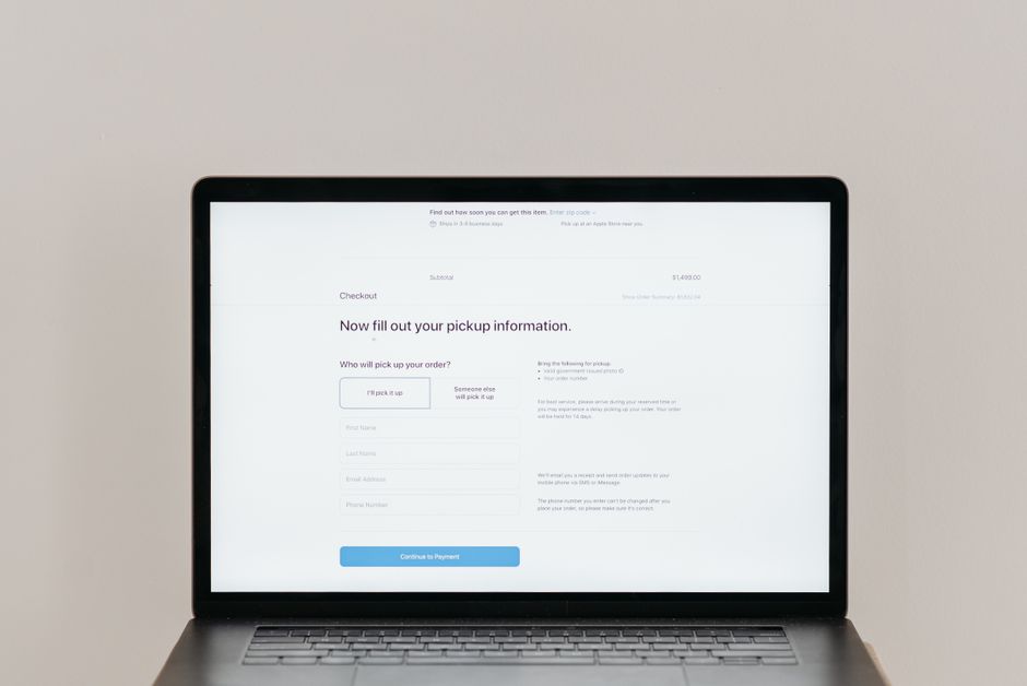
Why Your Checkout Page Is a Revenue Gateway, Not Just a Form
Your checkout page does one job: move people from intent to purchase. When that page looks cluttered, asks for unnecessary information, or makes navigation confusing, you are not just losing a sale, you are training customers to abandon your store. Small businesses often treat checkout as a technical necessity rather than a conversion point. That mindset costs real revenue.
Consider a hypothetical clothing store owner named Sarah. She spends hours perfecting her homepage and product pages but leaves her checkout as a default template. Customers add items, then disappear. Why? Because they hit three extra form fields, unclear shipping costs, and no guest checkout option. Those small friction points compound quickly.
Common Checkout Mistakes That Quietly Kill Conversions
Most checkout failures happen in broad daylight, not hidden bugs. Here are the mistakes that consistently drain revenue from small ecommerce stores:
- Requiring account creation before purchase. Forcing registration adds steps and raises privacy concerns. Many customers will simply leave rather than create another password.
- Hiding total costs until the final step. Surprise shipping fees or taxes cause immediate cart abandonment. Customers need to see the full price early.
- Poor mobile optimization. More than half of ecommerce traffic comes from mobile devices. If your checkout breaks on small screens, you are losing most of that audience.
- Overcomplicating the review process. Too many steps between cart and confirmation frustrates users. Each additional click increases the chance of abandonment.
How Simplified Forms Improve Customer Confidence
Reducing Friction Through Smart Field Design
Every field on your checkout form demands a decision from the customer. The goal is to make those decisions effortless. Start by auditing every input. Are you asking for the billing address when only shipping is needed? Do you really need the customer’s middle name?
A hypothetical electronics retailer removed four optional fields from their checkout and saw cart completion rates climb. The fields seemed harmless, but they introduced doubt. Was this information safe? Why did they need it? Removing those questions answered those unspoken concerns.
Smart Defaults and Auto-Fill Features
Modern browsers offer auto-fill capabilities that can dramatically reduce typing effort. Your checkout should support these features by using standard field names and structured layouts. When a customer’s address or payment information fills automatically, the mental load drops significantly.
However, auto-fill breaks when fields are labeled inconsistently or nested inside complex divs. Test your checkout flow with browser auto-fill enabled. If information does not populate correctly, customers face the tedious task of manual entry on every visit.
The Mobile Checkout Experience and Its Unique Challenges
Designing for Thumb-Friendly Navigation
On mobile, users interact primarily with thumbs. Buttons placed too far apart become hard to tap accurately. Form fields positioned poorly force users to scroll constantly. A well-designed mobile checkout anticipates these physical limitations.
Imagine a hypothetical fitness supplement brand whose checkout had a tiny “Continue” button tucked in the corner. Mobile users repeatedly missed taps, adding seconds to each step. Moving the button to a larger, centrally located position reduced completion time by nearly 30 percent in their testing.
Addressing Screen Size Limitations
Small screens demand prioritization. Not every detail belongs on the checkout screen itself. Progress indicators help users understand where they are. Collapsible sections keep long forms manageable. Clear typography ensures readability even under poor lighting conditions.
Avoid cramming everything onto one page. Instead, break the process into logical steps with visible progress markers. This approach prevents overwhelming customers while still maintaining momentum toward purchase.
Trust Signals That Convert During Checkout
Displaying Security Badges and Payment Icons
Security anxiety peaks during checkout. Customers wonder if their payment information is truly safe. Visible trust elements like SSL certificates, payment provider logos, and security badges quietly reassure users that the transaction is legitimate.
Place these indicators near payment fields, not buried at the bottom. A hypothetical home goods store added prominent Visa, Mastercard, and PayPal badges next to their payment form. They noticed fewer abandoned checkouts after customers reached the payment stage.
Clear Return and Privacy Policy Communication
Transparency builds trust. Clearly state your return policy, shipping timeline, and privacy practices during checkout. Avoid legal jargon that confuses rather than clarifies. When customers understand what happens after purchase, they feel more confident proceeding.
Link policies in concise language directly beneath relevant sections. Rather than redirecting users away from checkout, consider inline summaries that address common concerns without breaking flow.
Guest Checkout Versus Account Creation Tradeoffs
Balancing Convenience Against Long-Term Engagement
Forcing account creation increases short-term friction but can improve long-term retention. The challenge lies in offering both paths without overwhelming choice. Many successful stores provide guest checkout prominently while encouraging account creation through subtle benefits like order tracking or saved preferences.
A hypothetical subscription box service offered only guest checkout initially. After introducing optional account creation with perks like personalized recommendations, repeat purchase rates improved noticeably. The key was making the value proposition clear rather than mandatory.
Post-Purchase Account Invitation Strategies
Instead of requiring registration upfront, invite customers to create accounts after purchase. This approach captures transaction data first, then builds relationship afterward. Email follow-ups with account setup prompts often convert better than forced pre-checkout registration.
Include checkboxes during checkout asking if customers want accounts created automatically. This gives control back to the user while still collecting contact information for future marketing efforts.
Progress Indicators and Step Management
Making the Journey Predictable
Humans crave predictability. When customers know exactly how many steps remain, they are more likely to complete the process. Effective progress indicators show completed steps, current position, and remaining tasks clearly.
A hypothetical artisanal food delivery service used a simple three-step indicator labeled Cart, Delivery, Payment. Customers consistently moved forward because they always knew what came next. The visual cue reduced uncertainty that previously caused hesitation.
Avoiding Hidden Steps That Surprise Customers
Hidden steps like additional verification pages or unexpected form submissions break trust immediately. Always communicate new requirements before they appear. If an address verification step exists, mention it in the progress indicator so customers are not caught off guard.
Consider combining related actions into single screens whenever possible. Each screen transition represents a moment where customers can decide to leave. Minimizing transitions keeps attention focused on completing the purchase rather than navigating between pages.
Testing and Iterating on Checkout Performance
Identifying Where Customers Drop Off
Analytics tools reveal where customers abandon checkout most frequently. However, numbers alone do not explain why those drop-offs occur. Qualitative feedback through surveys or user testing sessions uncovers specific pain points that metrics cannot measure.
Imagine a hypothetical fitness apparel brand discovering high abandonment on shipping selection. Their data showed users lingering longer there than any other step. Follow-up surveys revealed confusion about delivery timeframes. Adding estimated arrival dates next to each shipping option resolved the issue without changing functionality.
Running Meaningful A/B Tests
Effective A/B testing isolates variables carefully. Changing button colors, form layouts, and copy simultaneously makes results impossible to interpret. Focus each test on one change at a time, ensuring statistically significant sample sizes before declaring winners.
Test radical simplifications against current flows occasionally. Sometimes removing entire sections produces surprising improvements. Other times, incremental tweaks yield better outcomes. Both approaches have merit depending on your confidence level in proposed changes.
Accessibility Considerations That Expand Your Audience
Ensuring Keyboard and Screen Reader Compatibility
Accessible checkout designs benefit all users, not just those with disabilities. Keyboard navigation allows power users to move faster. Screen reader compatibility ensures visually impaired customers can complete purchases independently. These enhancements often simplify interface complexity for everyone involved.
Maintain logical tab orders throughout checkout forms. Label fields descriptively for assistive technologies. Use sufficient color contrast ratios so low-vision users can read text easily. These adjustments rarely require major redesign efforts yet substantially expand reachable markets.
Responsive Design Beyond Basic Mobile Support
True responsiveness considers various device sizes and orientations. Tablets rotated horizontally present different layout challenges than vertically held phones. Landscape mode may alter form visibility unexpectedly. Testing across multiple devices reveals inconsistencies that automated checks miss.
Consider how checkout behaves on older devices with limited processing power. Heavy animations or complex scripts can cause slowdowns that frustrate users on budget smartphones. Prioritize functionality over flashiness when designing experiences meant for universal access.
Conclusion: Every Detail in Checkout Impacts Revenue
Checkout UX influences revenue more directly than almost any other website element. Unlike homepage design or blog content, checkout success translates immediately into measurable financial impact. Investing in thoughtful optimizations pays dividends quickly when approached strategically.
Start with foundational improvements like guest checkout options and simplified forms. Then layer in trust signals, mobile responsiveness, and accessibility enhancements. Continuous testing reveals hidden opportunities for improvement. Businesses treating checkout as a critical conversion point rather than administrative obligation consistently outperform competitors who neglect this vital stage.