
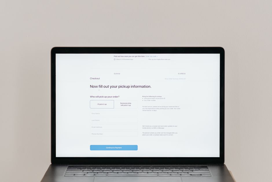
Why Checkout UX Matters More Than Your Homepage
Most visitors who add items to their cart never finish the purchase. While many business owners focus on homepage design or product pages, the checkout flow is where actual revenue gets confirmed or lost. Good checkout UX means fewer steps for customers to complete a purchase.
Think of checkout as the final handshake between you and your customer. If the process feels complicated, slow, or asks for irrelevant information, trust breaks down and the sale disappears.
Common Checkout Mistakes That Quietly Kill Conversions
Here are mistakes frequently seen in both Shopify and WordPress stores that silently drain sales:
- Requiring an account before purchase
- Hidden fees that appear only at the final step
- Forcing users to navigate multiple pages for basic tasks
- Asking for too much personal information too early
- Using unclear labels or jargon on buttons and fields
Each of these issues creates doubt. When customers pause to think instead of tapping or clicking through, they often leave and never return.
Mobile-Specific Problems in Checkout Flows
More than half of ecommerce traffic comes from mobile devices, yet many checkout designs assume a desktop experience. Fields that are too small to tap accurately or buttons placed too close together lead to frustration and accidental actions.
Poor mobile UX often forces users to zoom in to read text or reposition forms, increasing the chances they will abandon their cart and take their business elsewhere.
How Form Design Influences Purchase Behavior
Forms are a major part of checkout UX, and they need thoughtful design to keep shoppers engaged. Reducing the number of required fields is a simple but effective change. Asking for billing and shipping addresses only when necessary helps avoid overwhelming the user.
Real-time validation that highlights errors clearly and immediately prevents confusion. Instead of submitting and seeing a generic error message, shoppers appreciate guidance that shows exactly what went wrong.
Smart Defaults and Autofill Support
Supporting browser autofill saves time for returning customers and reduces typos. Smart defaults, such as pre-selecting the most common shipping method or matching currency based on location, also remove barriers to purchase.
However, defaults must be transparent. Hidden selections or pre-checked boxes for optional add-ons that increase price can damage trust even if legally permissible.
Building Trust During Checkout
One of the biggest barriers to completing a purchase is trust. Customers want assurance that their payment information is secure and that they are dealing with a legitimate business.
Displaying recognizable trust badges, SSL certificates, and accepted payment methods early in the checkout flow helps reduce anxiety. Including clear contact information and return policies reassures buyers.
Progress Indicators That Guide Without Pressure
Progress indicators show users how much of the checkout process remains. However, these indicators need to be accurate. Showing a short process that suddenly extends into additional steps creates distrust.
Clear labels such as Billing Information, Shipping Options, and Payment Details set expectations. Avoid vague names like Step 1 or Continue that leave users guessing what comes next.
Optimizing for International Buyers
For stores serving customers outside their home country, checkout UX becomes even more complex. Currency conversions, tax calculations, and shipping options need to be presented clearly from the start.
Pre-filling address formats appropriate to the customer’s country prevents confusion. Localizing form fields, such as including state or province dropdowns only where applicable, improves the experience.
Language and Cultural Considerations in Forms
Translating checkout pages is not enough. Cultural expectations around privacy, data collection, and purchasing behavior differ across regions. Some markets prefer cash-on-delivery options, while others rely heavily on digital wallets.
Offering familiar payment methods such as Alipay, Klarna, or UPI in relevant regions removes hesitation and increases conversion rates.
Streamlining the Payment Step
The final stage of checkout needs extra attention because that is where committed buyers decide to complete their purchase or abandon it. Offering guest checkout options eliminates unnecessary friction.
Supporting popular digital wallets alongside traditional card payments gives customers flexibility. Mobile-friendly payment buttons like Apple Pay and Google Pay reduce the amount of typing required.
Clear Pricing and Fee Communication
Surprise costs at the final step are one of the strongest reasons for cart abandonment. Showing all fees, including taxes and shipping, earlier in the process builds trust and prevents last-minute cancellations.
When taxes or shipping costs vary by location, providing estimates upfront helps customers decide if the purchase is worth it before entering payment details.
Testing and Improving Checkout Over Time
No checkout design remains perfect forever. Customer behavior shifts and new payment technologies emerge. Regular reviews and iterative improvements ensure the checkout experience stays effective.
Simple methods such as reviewing exit point analytics, collecting customer feedback, and conducting quick usability tests reveal which parts of checkout cause friction.
Measuring Success Beyond Conversion Rates
Besides tracking completed purchases, businesses should monitor average order value, time spent on each checkout step, and error frequency. These metrics help identify whether changes improve overall performance or just shift problems elsewhere.
Using heatmaps or session recordings, where compliant with privacy regulations, can show where shoppers hesitate or struggle, pointing to specific opportunities for improvement.
Wrapping Up: Small Changes That Create Big Results
Checkout UX affects sales because it represents the moment of commitment between interest and action. By removing unnecessary steps, simplifying form design, building trust, and accommodating international buyers, small ecommerce stores can convert more visitors into paying customers.
Improving checkout does not require major rebuilds. Thoughtful adjustments to field placement, progress indicators, payment options, and fee transparency often produce measurable gains. Continuous testing and refinement help keep the checkout experience aligned with evolving customer expectations.