
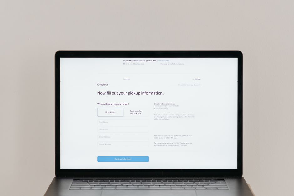
When a shopper reaches your checkout, they have already decided they want something. That is the good news. The bad news is that the checkout is where a large share of those ready-to-buy visitors quietly leave. One of the most common reasons has little to do with price or product and everything to do with a single design choice: whether you let people buy as a guest or force them to create an account first.
Why the Account Wall Stops Sales
Forcing account creation asks for effort at the exact moment a customer expects the process to be nearly finished. Picture a shopper on their phone during a lunch break who has found the one item they need. They click checkout, see a form asking them to invent a password, confirm an email, and fill in details they were not planning to share, and many simply close the tab. They were not rejecting your store. They were protecting their time.
Creating an account feels like a commitment that comes before the reward, and that ordering is backwards. The reward, owning the product, should come first. Account creation is a relationship you earn after a good first experience, not a toll you charge at the door. When you place a registration form between a shopper and their purchase, you are asking them to trust you with a password before you have proven the transaction is worth completing.
This matters even more for first-time visitors who do not yet know your brand. A returning customer might tolerate the extra step because they value the convenience of saved details. A new one has no such loyalty, so the friction lands hardest on exactly the people you most want to convert.
What Guest Checkout Really Means
Guest checkout lets a customer complete a purchase without registering an account. They enter the shipping and payment details they need, pay, and leave. On Shopify this is a store setting you can control, and on WooCommerce and other WordPress setups it is a standard option in the checkout configuration. In most cases it is not something you need custom development to enable.
The key point is that guest checkout does not mean anonymous checkout. You still collect the name, email, and address required to ship the order and send a receipt. You are simply not demanding a password and a registered profile as the price of entry. This distinction matters because owners sometimes resist guest checkout out of fear they will lose all customer information, which is not accurate. The data that fulfils the order is still yours.
The Trade-off You Are Making
Choosing between guest checkout and mandatory accounts is a real trade-off, and it helps to see both sides clearly rather than treating guest checkout as an automatic win.
What You Gain
The main gain is fewer abandoned carts at the final step. Removing a required step removes a reason to leave. You also tend to see faster completions, because a guest path has fewer fields and no password reset risk for people who forgot a login they rarely use. First-time buyers in particular respond well to being allowed to simply buy, and a smooth first purchase is what earns the second one.
What You Give Up
Registered accounts give you a few things guests do not. You get a customer profile that makes repeat ordering faster, a login that supports order history and saved addresses, and a cleaner record of who your returning buyers are. If your business depends on repeat purchases, accounts have genuine value. The mistake is treating that value as more important than the first sale, since a customer who never completes checkout never becomes a repeat buyer at all. A registered account with zero orders is worth less than a guest order that ships and gets delivered well.
How to Offer Both Without Losing Data
You do not have to choose one or the other. The strongest checkout UX pattern is to make guest checkout the default and offer account creation as an optional step after the purchase is complete. Let the customer pay first. On the confirmation screen, invite them to save their details by creating a password so next time is faster. At that moment they have already received their order confirmation, so the request feels like a convenience rather than a barrier.
You can also pre-fill account creation for anyone who is already logged in, so returning customers never see the choice at all and move straight through. This approach keeps the low friction of guest checkout for new shoppers while still capturing accounts from the people who genuinely want them. You end up with the best of both paths instead of forcing everyone down one.
Checkout UX Details That Reduce Friction
Guest checkout is the biggest single change, but a few surrounding details decide whether it actually works.
Progress clarity helps. If your checkout has multiple steps, show a simple indicator so shoppers know how far they are and how much is left. A short, visible path reduces the sense that the process is endless. When people can see the finish line, they are more likely to keep going.
Error messages deserve attention too. A vague message like invalid input stops a shopper cold. Specific messages that say which field failed and how to fix it keep people moving. This applies to address validation, payment declines, and email format checks alike. If a card is declined, tell the shopper plainly and suggest trying another method rather than leaving them to guess.
Keep required fields to the minimum. Every extra field is another chance to leave. If you truly need a phone number for delivery, explain why or make it optional. Ask only for what the order requires, and consider using address lookup tools so a full shipping address takes a few keystrokes instead of a dozen fields.
Common Mistakes With Guest Checkout
A few patterns quietly undercut the benefit. Hiding the guest option so it is hard to find is the most common. If the account form is the loud, default path and guest checkout is a small text link at the bottom, you have not really offered a choice. Make the guest path a clear, equal option beside account creation, not an afterthought.
Another mistake is surprising people with costs at the final step. Shipping fees or taxes that appear only at the last screen make shoppers feel tricked, and no amount of guest convenience repairs that. Show the full picture as early as you honestly can, ideally in the cart, so the final total holds no surprises.
A third mistake is forcing registration again on the return visit by not saving anything, which erases the value of the accounts you did capture. If someone bothers to create an account, make sure the next visit actually rewards them with saved details and a faster checkout.
What to Measure After the Change
Before changing anything, record where your checkout currently loses people. Most analytics tools and the built-in Shopify reports will show the drop between cart, checkout, and completed purchase. Make the guest checkout change, then watch that specific drop over the following weeks rather than judging by overall revenue alone, which moves for many unrelated reasons.
Watch completion rate, the share of orders placed by guests versus registered accounts, and the rate at which guests choose to create an account on the confirmation screen. If guest orders rise and account creation holds steady or grows, you have removed friction without giving up relationships. If account signups fall sharply, you can adjust the wording and placement of the post-purchase invitation rather than forcing the wall back up.
Guest checkout is not a clever trick. It is a matter of respecting the point a shopper has already reached. By letting people buy first and inviting them to register second, you keep the door open for the customers who are ready now while still building the profiles that support future orders. Test it against your own numbers, keep the guest path easy to find, and let the results, not assumptions, guide the decision.