
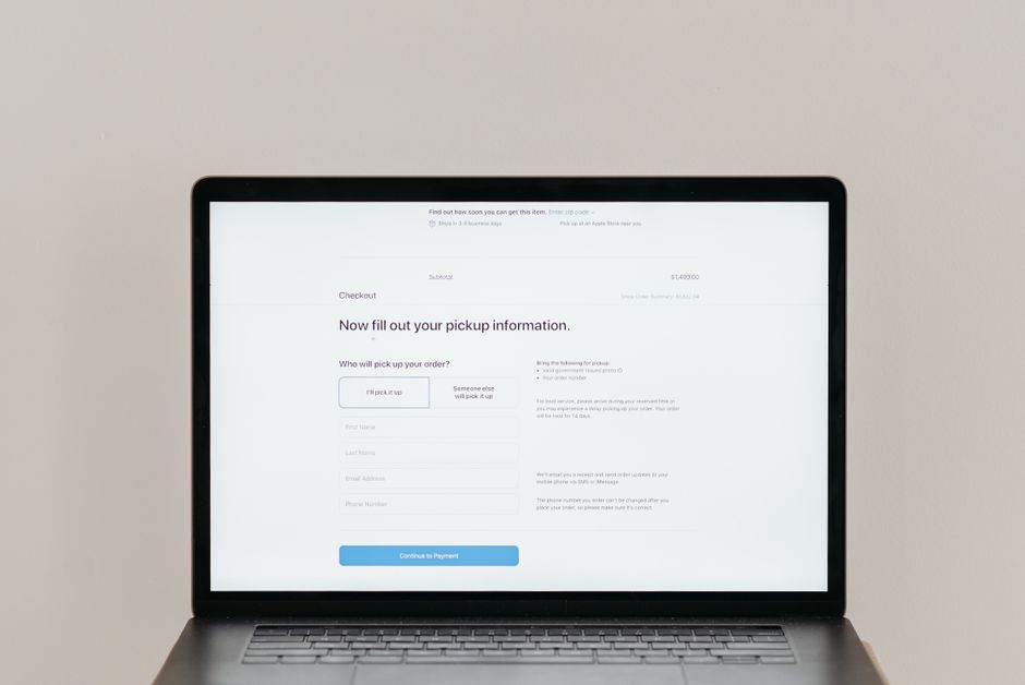
Why Checkout UX Directly Impacts Revenue
Every additional step or confusing element in a checkout adds friction that pushes potential buyers toward abandonment. Research consistently shows that a single extra click can cut completion rates by a measurable margin, especially when shoppers are on mobile devices with limited patience. Understanding the direct line between user experience and revenue helps prioritize the right fixes.
The cost of a single extra click
When a shopper must navigate an unnecessary confirmation screen, the chance of dropping off rises. Even a half‑second delay in loading a payment page can reduce conversions because the perception of speed influences trust. Small businesses often overlook these micro‑delays, assuming the impact is negligible.
How friction compounds across sessions
Friction does not disappear after one visit. A shopper who abandons once is less likely to return, and the brand memory of a clunky process lingers. Over time, the cumulative loss from repeated abandoned carts can outweigh the cost of a redesign.
Mapping the Shopper Journey From Cart to Confirmation
Before changing any interface, chart each decision point a buyer encounters from the moment they view the cart to the final order confirmation. This map reveals where expectations diverge from reality and where cognitive load spikes.
Identify decision points
Typical decision points include reviewing items, entering shipping details, selecting a payment method, and confirming the order. Mark each point on a flowchart and note the number of fields, clicks, and visual changes required.
Align messaging with expectations
If a shopper sees a “Free Shipping” banner on the product page but the checkout shows a fee, trust erodes instantly. Ensure that every promise made earlier in the funnel appears verbatim in the checkout summary.
Designing a Mobile First Checkout Flow
More than half of ecommerce traffic now originates from smartphones. A checkout that works on desktop but collapses on a small screen loses a massive slice of revenue. Designing for mobile first forces simplicity that benefits all devices.
Touch friendly targets and spacing
Buttons and form fields should meet a minimum 48 pixel height and have generous padding to prevent accidental taps. Group related fields vertically rather than side‑by‑side to avoid horizontal scrolling.
Autofill and address validation
Enable browser autofill for name, email, and address fields. Integrate an address lookup service that suggests complete addresses as the user types, reducing keystrokes and typos.
Reducing Form Fields Without Losing Data
Long forms are a top abandonment driver. The goal is to collect only what is essential for fulfillment and fraud prevention, while still capturing marketing‑relevant data later.
Progressive disclosure techniques
Show the minimal set of fields first — email, shipping address, payment. Reveal optional fields such as phone number or company name only after the core steps are complete, using a clear “Add optional details” link.
Smart defaults and guest checkout
Pre‑select the most common shipping method and payment type based on the shopper’s locale. Offer a true guest checkout that does not force account creation; allow account creation after purchase with a single click.
Using Microinteractions to Guide Users
Subtle animations and instant feedback reassure shoppers that the system responds to their actions. Well‑crafted microinteractions reduce uncertainty and keep momentum toward completion.
Visual feedback on button press
When the “Place Order” button is tapped, change its label to “Processing…”, disable it, and display a spinner. This prevents double submissions and signals that the request is in progress.
Error handling that teaches
Inline validation messages should appear next to the offending field, explain the problem in plain language, and suggest a fix. Avoid generic “Invalid input” alerts; instead use “Please enter a valid ZIP code”.
Trust Signals Inside the Checkout
Security concerns peak at the payment stage. Visible trust cues can convert hesitation into confidence without cluttering the layout.
Security badges placement
Place recognized badges — SSL seal, PCI DSS compliance, money‑back guarantee — directly beside the payment fields. Keep them small but legible; a row of three icons works well on both desktop and mobile.
Transparent pricing and shipping
Show the final total, including taxes and shipping, before the payment step. If shipping varies by speed, present a concise table with delivery dates and costs so the shopper can decide without leaving the page.
Testing and Iterating Checkout Improvements
Assumptions about what works should be validated with real traffic. A structured testing program turns subjective ideas into measurable gains.
A/B test structure
Test one variable at a time — button color, field order, presence of a trust badge. Run the experiment until statistical significance reaches at least 95 % confidence, then implement the winner and move to the next hypothesis.
Analytics events to watch
Track events such as “checkout_started”, “shipping_entered”, “payment_selected”, and “order_completed”. Funnel reports built from these events pinpoint the exact stage where drop‑off spikes.
Common Pitfalls That Undermine Checkout UX
Even well‑intentioned designs can hide conversion killers. Recognizing these patterns early saves time and money.
Hidden fees revealed late
Adding handling fees or mandatory insurance on the final review page feels deceptive. Disclose all costs up front or bundle them into the product price.
Forced account creation
Requiring registration before purchase adds a barrier that many first‑time buyers refuse to cross. Offer a seamless guest path and invite account creation after the order is confirmed.
Checklist for a High Converting Checkout
Use this quick audit before each release to keep the checkout lean and trustworthy.
- All form fields have clear labels and autocomplete attributes
- Mobile tap targets meet 48 pixel minimum
- Progress indicator shows current step and total steps
- Trust badges visible next to payment fields
- Total price, tax, and shipping displayed before payment
- Guest checkout enabled with optional post‑purchase account creation
- Inline validation messages are specific and helpful
- Button states (default, hover, disabled, loading) are distinct
- Analytics events fire at each funnel stage
- A/B test plan documented for the next two weeks
Applying these principles consistently turns a leaky checkout into a reliable revenue engine. Start with the audit, prioritize the highest‑impact changes, and measure the results. Over time, incremental improvements compound into a noticeable lift in completed orders and overall customer satisfaction.