
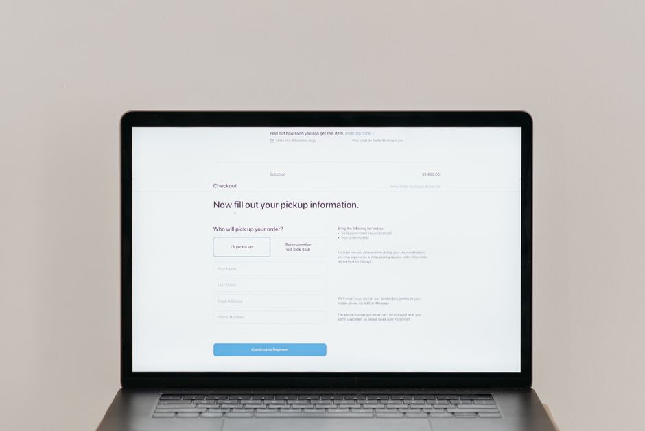
Why Checkout UX Matters for Sales
The checkout page is the final gate between a visitor and a completed purchase. When the experience feels confusing or time consuming, shoppers often leave without buying. Research shows that even small friction points can increase abandonment rates dramatically. For small business owners, every lost transaction means lost revenue and wasted marketing spend. Improving the checkout flow is therefore one of the highest‑impact changes you can make to an online store.
Common Checkout UX Mistakes
Overcomplicated Form Fields
Asking for unnecessary information forces customers to type more than they want. Fields such as middle name, company name, or multiple address lines are rarely needed for a standard purchase. Each extra field adds cognitive load and raises the chance of a typo that triggers an error message. Keep the form to the essentials: name, email, shipping address, and payment details.
Forced Account Creation
Requiring a shopper to register before they can pay creates a barrier that many will not cross. First‑time buyers often prefer a quick guest checkout. Offering a clear “Continue as guest” option reduces drop‑off and still allows you to capture an email for future marketing.
Hidden Costs and Surprises
Displaying shipping fees, taxes, or handling charges only at the last step feels deceptive. When the total jumps unexpectedly, trust erodes and the shopper may abandon the cart. Show an estimated total early, ideally on the product page or in the cart summary, so the final price matches expectations.
Poor Mobile Layout
More than half of ecommerce traffic comes from phones. If the checkout form requires horizontal scrolling, tiny tap targets, or zooming, mobile users will give up. Use a single‑column layout, large input boxes, and native keyboards for each field type (numeric for card numbers, email for address). Test on real devices, not just emulators.
Lack of Progress Indicators
When shoppers cannot see how many steps remain, they feel uncertain about the time commitment. A simple step bar — “Cart → Shipping → Payment → Review” — gives a sense of control and reduces anxiety. Highlight the current step and keep the number of steps to three or four at most.
Designing a Frictionless Checkout Flow
Simplify Input Requirements
Use address autocomplete powered by a reliable API so customers select their address with a few keystrokes. Auto‑detect card type from the first digits and format the number in groups of four. These small helpers cut typing time and errors.
Offer Guest Checkout
Place the guest option prominently, not hidden behind a “Create account” button. After the purchase, invite the buyer to create an account with a single click, using the information they already entered. This preserves the low‑friction path while still building your customer database.
Show Transparent Pricing Early
Include a shipping calculator in the cart that updates instantly when the zip code changes. Display tax estimates based on the billing address. If you offer free shipping thresholds, show a progress bar (“Add $12 more for free shipping”). Transparency builds confidence and can increase average order value.
Optimize for Touch Targets
Buttons and form fields should be at least 48 px tall and spaced enough to avoid accidental taps. Use native select menus for country and state rather than custom dropdowns that are hard to manipulate on a phone. Ensure the “Place order” button stays visible without scrolling on the final step.
Use Clear Step Navigation
Label each step with a verb (“Enter shipping”, “Choose payment”, “Review order”). Provide a back link that preserves entered data. Avoid resetting the form when a shopper returns to a previous step; losing data is a top reason for abandonment.
Testing and Measuring Checkout Performance
Set Up Funnel Analytics
Configure a funnel in your analytics platform that tracks each checkout stage. Identify the step with the highest drop‑off rate. That single metric tells you where to focus design effort first.
Conduct Usability Sessions
Recruit a handful of target customers and watch them complete a purchase on a staging site. Note where they hesitate, ask questions, or make errors. Qualitative insight often reveals issues that numbers alone miss.
A/B Test Critical Elements
Test one change at a time — button color, field order, presence of a trust badge, or the wording of the “Continue as guest” link. Run the test until statistical significance is reached, then implement the winner. Iterate continuously rather than trying a massive redesign all at once.
Platform Specific Tips for WordPress and Shopify
WooCommerce Checkout Customization
WooCommerce lets you reorder, add, or remove fields via hooks or a dedicated plugin. Remove the “Company name” and “Order notes” fields if they are not required. Use a plugin that adds address autocomplete without writing code. Keep the checkout template clean by disabling unnecessary sidebar widgets on that page.
Shopify Checkout Extensions
Shopify’s checkout is locked down for security, but you can use Checkout Extensions to add custom fields, upsell offers, or a loyalty points selector. Enable Shop Pay for accelerated checkout; it stores encrypted payment details and reduces form filling for returning shoppers. Test any extension on a development store before pushing live.
Checklist for a High Converting Checkout
- Only essential form fields are shown
- Guest checkout is the default option
- Total cost, including shipping and tax, appears before payment
- Progress indicator displays current step and remaining steps
- Address autocomplete and card formatting are active
- Touch targets meet minimum size guidelines
- Mobile layout is single column with no horizontal scroll
- Analytics funnel tracks each stage
- Regular usability testing is scheduled
- A/B testing plan covers button text, trust signals, and field order
Final Thoughts
Improving checkout UX is not a one‑time project; it is an ongoing cycle of measurement, hypothesis, and refinement. Start by fixing the most obvious friction points — extra fields, forced registration, hidden fees — then validate the impact with data. Small, incremental changes compound over time, turning a leaky funnel into a reliable revenue engine for your business.