
Introduction: The Hidden Cost of Ignoring Checkout Accessibility
When a small business owner launches a new online store, the focus usually lands on product photography, pricing, and marketing. The checkout experience is often treated as a necessary evil—a series of fields that simply have to be there. Yet statistics from the e‑commerce industry consistently show that a sizable portion of potential customers abandon a purchase because the checkout flow is difficult, confusing, or outright unusable for them.
Consider a hypothetical boutique retailer, “Leaf & Lark,” that sells handmade home goods. In its first quarter, the store enjoys steady traffic, but the conversion rate hovers around 2.3 %. After reviewing analytics, the owner notices that the bounce rate spikes on the payment page. A quick usability test with a friend who uses a screen reader reveals that labels are missing, tab stops are skipped, and contrast is insufficient. By addressing these issues, Leaf & Lark increases its conversion rate to 4.1 % within a month, effectively doubling sales without acquiring new customers.
This example illustrates a broader truth: checkout accessibility is not just a compliance checkbox; it is a direct lever for revenue growth. When every visitor—whether using a keyboard, voice control, or assistive technology—can complete the purchase without friction, the business reaps measurable benefits.
Why Accessibility Matters Beyond Compliance
Accessible checkout design goes far beyond meeting legal standards such as the Web Content Accessibility Guidelines (WCAG) or the Americans with Disabilities Act (ADA). It aligns with brand reputation, expands market reach, and reduces support overhead.
People with visual, motor, cognitive, or neurological differences represent a significant portion of the consumer base. According to the World Health Organization, over one billion people live with some form of disability. By creating a seamless checkout experience for this group, a retailer effectively opens a new customer segment that might otherwise be overlooked.
Moreover, an accessible checkout signals that a business cares about all users. This perception builds trust, which is a critical factor in high‑ticket purchases and subscription models. Trust elements, such as clear privacy statements and visible security cues, become even more persuasive when the overall experience feels inclusive.
Common Accessibility Barriers in Checkout Flows
Even well‑intentioned designs can hide obstacles that prevent smooth completion. Below are the most frequent pain points identified in both WordPress and Shopify implementations.
Inconsistent Labeling and Placeholder Text
Using placeholder text as the sole form label is a classic mistake. When a field is focused, the placeholder often disappears, leaving the user with no clear indication of what information is required. Screen reader users rely on programmatic labels to understand each field, and missing or improperly associated labels create confusion.
Inadequate Keyboard Navigation
A checkout page that cannot be fully traversed using only a keyboard excludes users who cannot operate a mouse. If a “Submit” button is not reachable via the Tab key, or if focus jumps unexpectedly, the user may become stuck or submit incomplete data.
Lack of Color Contrast and Readable Typography
Text that blends into a background or uses low‑contrast colors forces users with low vision to strain their eyes. Inconsistent font sizes and weights also make it difficult to scan important instructions, such as required fields.
Complex Language and Unclear Error Messages
Technical jargon or ambiguous phrasing can overwhelm users with cognitive disabilities. Error messages that simply say “Invalid input” without specifying what is wrong and how to fix it increase frustration and abandonment rates.
Missing or Unclear Focus Indicators
When a user navigates with a keyboard, visual feedback indicating the currently focused element is essential. A thin outline or a missing highlight can make it impossible to know which field will receive input.
Designing Clear, Language‑Friendly Checkout Forms
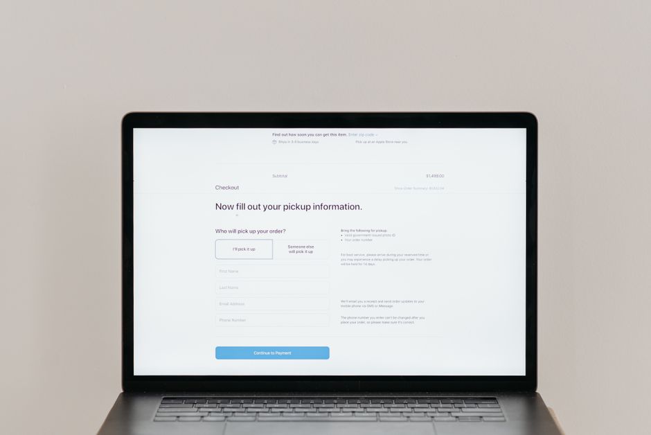
The foundation of an accessible checkout begins with form design. Start by eliminating placeholder‑only labels. Each input should have a visible, descriptive label placed near the field, and the label must be programmatically associated with its input via proper HTML attributes.
Use plain language that reflects the user’s mental model. Instead of “Enter your ancillary billing details,” a clearer phrase might be “Add a separate shipping address.” Avoid acronyms and jargon unless they are industry‑standard and explained.
Structure fields logically. Group related information together, such as billing address and payment details, using field sets and headings. This not only improves readability for screen‑reader users but also reduces cognitive load for all shoppers.
Error handling should be proactive. Provide inline validation that appears immediately after a field loses focus, describing the exact problem (“Please enter a valid email address”) and offering a suggestion for correction. Ensure these messages are announced by assistive technologies and remain visible even if the user is navigating with a screen reader.
Ensuring Full Keyboard Navigation Support
Keyboard accessibility is a baseline requirement for any e‑commerce platform. Test the checkout flow by turning off the mouse and using only the Tab, Shift + Tab, Enter, and Space keys.
Key considerations include:
- Logical tab order that follows the visual layout.
- All interactive elements—such as radio buttons, checkboxes, and custom select components—must be reachable.
- Focus indicators should be clearly visible, typically a high‑contrast outline or background change.
- Modal dialogs or payment gateways opened during checkout should be accessible via keyboard and include a method to close them without a mouse.
WordPress plugins and Shopify themes often add custom JavaScript that can interfere with keyboard navigation. Developers should verify that any custom scripts preserve focus management and do not trap the user in an unintended state.
Visual Contrast, Typography, and Readability
Contrast ratios are a measurable element of WCAG Level AA compliance. Text must have a contrast ratio of at least 4.5:1 against its background. This ensures that users with low vision can still read instructions, error messages, and product information.
Choose legible fonts with adequate spacing and weight. Avoid all‑caps headings and overly decorative typefaces for body text. Ensure that required field markers—such as asterisks or “*Required” labels—are distinguishable from optional fields.
Use white space strategically. Crowded fields can overwhelm users and make it difficult to associate labels with inputs. Consistent padding, clear grouping, and appropriate line heights improve the overall scanning experience.
Testing with Real Users and Assistive Technology
Theoretical compliance checks are valuable, but real‑world testing uncovers nuanced issues. Recruit participants who use screen readers, switch devices, or have motor impairments to navigate the checkout process.
Consider using automated testing tools that simulate assistive technology, such as axe or WAVE. These tools can flag missing alt text, improper ARIA attributes, and low‑contrast elements. However, they cannot replace human insight, especially for cognitive load and usability.
Record sessions where users complete a purchase or encounter an error. Analyze where they hesitate, where they restart the process, or where they abandon the checkout. These data points guide concrete improvements that directly affect conversion rates.
Leveraging Design Patterns That Simplify Decision Making
Even with perfect accessibility, checkout fatigue can still occur. Design patterns that reduce the number of decisions help keep conversion rates high.
Offer guest checkout as a default option, with the signup choice presented later. Unnecessary account creation steps often scare off first‑time buyers. When a business requires accounts for loyalty programs, make the benefit clear upfront.
Group payment options using tabs or accordion controls. This prevents visual clutter and helps users focus on one method at a time. Additionally, display trusted payment icons and security badges prominently to reinforce confidence.
Implement progressive disclosure for optional fields. Show only essential fields first, then reveal extra options like gift messages or insurance after the primary information is entered. This keeps the form length manageable while still capturing additional data when desired.
Mobile and Tablet Checkout Considerations
Accessibility on mobile devices involves both touch targets and orientation. Buttons and links should be at least 44 × 44 pixels to accommodate finger precision. Ensure that focus indicators adapt to touch interactions, often using a visible ring around the focused element.
Viewport scaling must preserve readability. Avoid horizontal scrolling on the checkout page, as this can cause text to become unreadable or forms to misalign. Use responsive design techniques that restructure fields for smaller screens, such as stacking address lines vertically.
Consider the impact of virtual keyboards. Some input types, like email and credit card numbers, trigger specialized keyboards on mobile devices. Test that the layout remains usable when the keyboard appears, ensuring that fields stay in view and labels remain visible.
Measuring the Impact of Accessibility Improvements
Before making changes, establish baseline metrics. Track conversion rate, bounce rate, average time on page, and abandonment points. After implementing accessibility enhancements, monitor these metrics over a 4‑ to 6‑week period.
Analyze segmentation data: compare conversion rates for new visitors versus returning customers, and note any improvements in form completion success. Additionally, monitor support tickets related to checkout issues; a reduction in such inquiries indicates a smoother experience.
Use A/B testing to validate specific changes, such as adding clear labels or adjusting contrast. While accessibility improvements often benefit all users, A/B testing provides quantitative confidence that the changes drive the desired outcome.
Practical Steps to Audit and Improve Your Checkout
Begin with a comprehensive audit. Use a checklist that covers labeling, keyboard navigation, color contrast, focus indicators, language clarity, and error messaging. Automated tools can catch many of these items quickly.
Engage a developer familiar with WCAG guidelines and the specific platform—whether WordPress or Shopify. Often, small adjustments like adding aria‑label attributes, correcting tabindex order, or updating CSS contrast values can resolve multiple issues at once.
After implementing fixes, conduct user testing with at least five participants representing different abilities. Document findings and prioritize fixes based on impact on conversion and ease of implementation.
Finally, integrate accessibility checks into the regular development workflow. Make it a standard part of code review and QA processes. This prevents regression when new features are added or themes are updated.
Conclusion: Accessibility as a Revenue Driver
Accessible checkout UX is more than a technical requirement; it is a strategic advantage. By removing barriers for users with disabilities, businesses unlock new markets, build trust, and see measurable improvements in conversion rates. The process involves clear labeling, robust keyboard support, proper visual contrast, and continuous testing with real users.
Small business owners who prioritize accessibility often find that the investment pays off quickly through higher sales and reduced support overhead. In a competitive e‑commerce landscape, an inclusive checkout experience can be the differentiating factor that turns browsers into loyal customers.